We have all been there, right? We click on a link or type in a URL incorrectly only to find the dreaded 404 “page not found” error message. We smirk with frustration and then hit the exit button. There: a sales opportunity lost! Well, we understand that 404 situations are hard to avoid. But, the lost customer situation can definitely be avoided. How? Let’s reveal the best ways to engage customers through your 404 pages. Be it through interactive content or product demo videos, a 404 page can always become useful!
This is going to be fun! Let’s begin.
1. Add Value Using Interactive Content
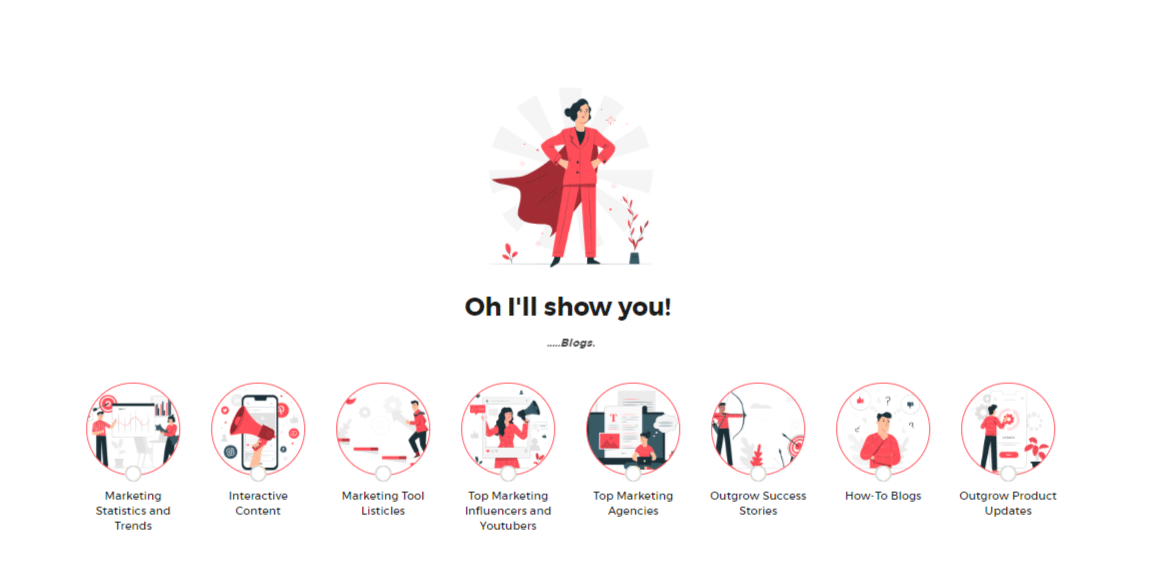
Interactive content has always been a one-stop solution not just to generate leads but also to engage customers and add value to them. In fact, 81% of marketers agree that interactive content is far more effective in grabbing people’s attention than static content. It could be anything – calculators, quizzes, assessments, polls, surveys, etc. You can embed different types of interactive content on your 404 error page not found and instead of losing visitors, you can generate leads! For instance, Here is the quiz we embedded on Outgrow’s error 404 page.

Outgrow is a platform that allows you to create interactive content. So the 404 error page for Outgrow contains a quiz to find content on the Outgrow page. You can choose the category of blogs you want to look at. There are options such as ‘Interactive Content’, ‘Marketing Tool Listicles’, ‘Outgrow Success Stories’, and much more. You can choose any of these categories and you will be directed to the relevant blogs. Users get educated about the kind of content Outgrow offers and they can use a quiz to be directed to it.
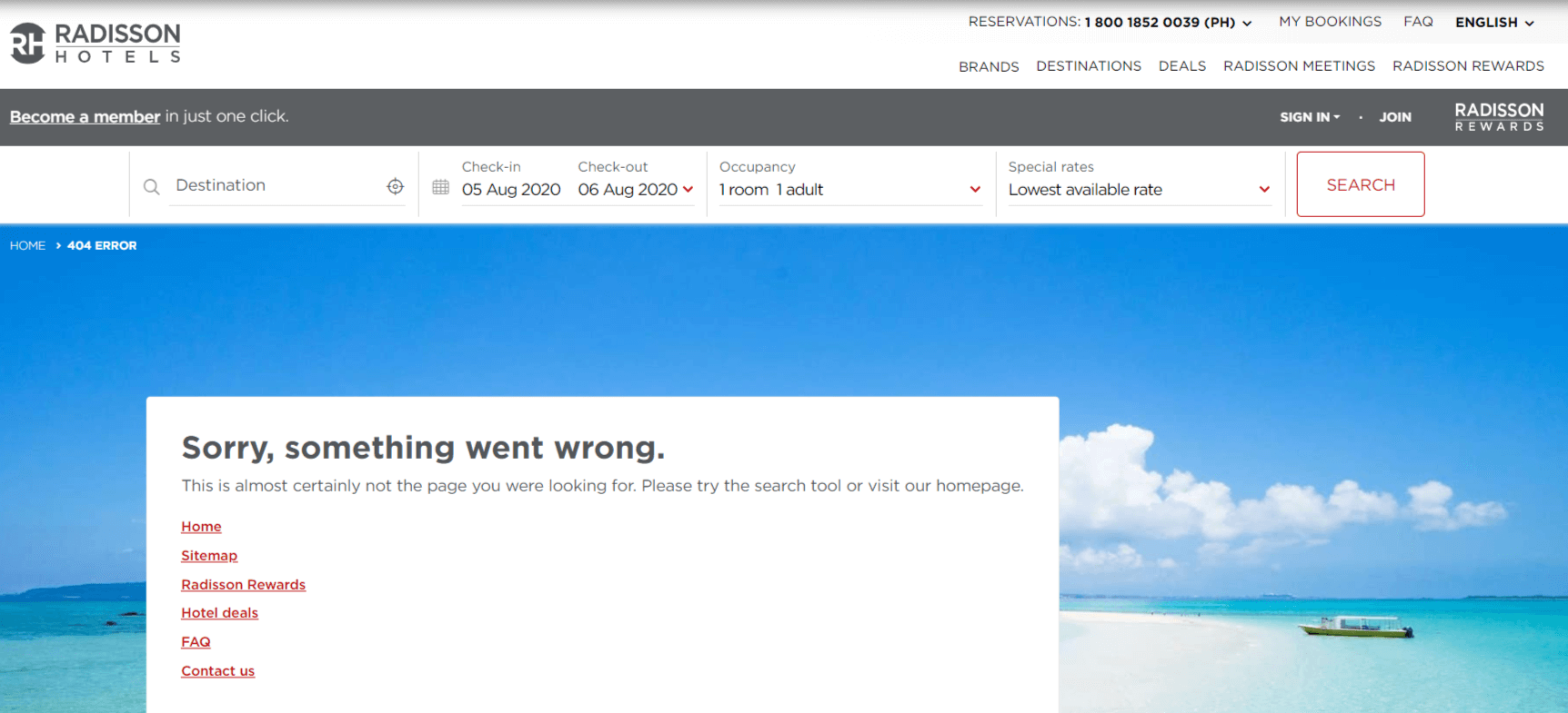
Here is another example of an engaging 404 page not found by Radisson Blu. They have used a search filter to help users find out products on the basis of their choices and preferences. This can easily be replicated with an e-commerce recommendation or an outcome quiz! You can use interactive content types like polls and trending giveaways and contests as well to increase engagement with your users. There are a lot of 404 error page templates for you to take inspiration from!
2. Catch The Eye With Attractive UI
A good UI and UX design never harmed anyone. It immediately creates a good impression of you to your visitor and helps you make your mark. A good user interface pleases the human eye and makes customer acquisition more likely. In fact, a well-designed user interface can raise your website’s conversion rate by up to 200%
Just like a website, a 404 page can also benefit from a good UI design. A good UI design is a sign of confidence and makes your visitor trust you more. It makes it easier for them to understand the contents on the page and choose the right CTA.
Here is an example of a fun and very good-looking 404 error page by Mantra Labs. They have created a theme around an astronaut who has run out of oxygen in space. Even though it isn’t exactly about what they offer as a service, it is enticing and makes the user want to know more about them.
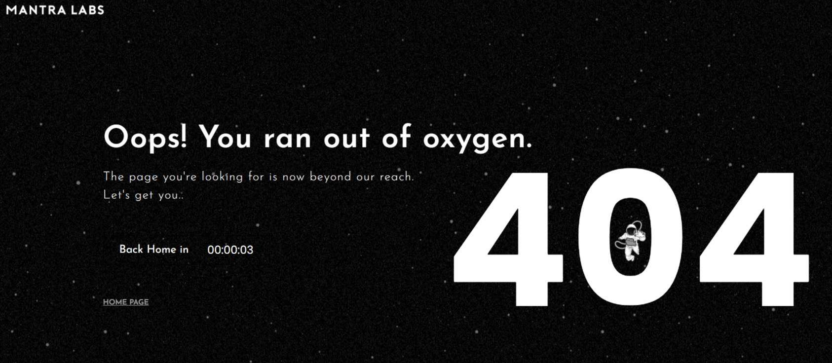
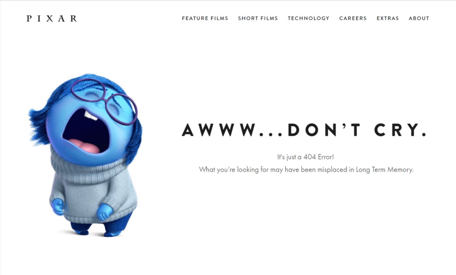
The page also has an automatic trigger to direct you to the homepage after a certain number of seconds. Here are more examples by Pixar and Pierre Herme and Amazon and Visme for you to get a few ideas for your stylish 404 error page!
3. Give The Customer Somewhere To Go – Include CTAs (But Don’t Overwhelm)
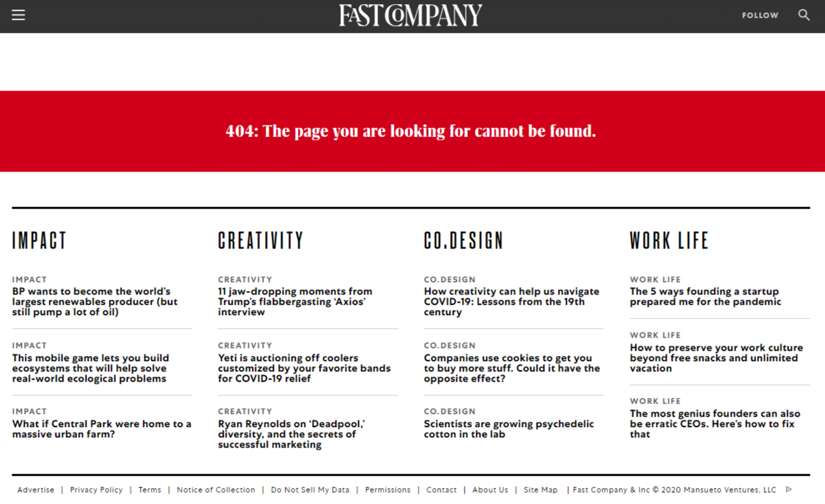
When a customer ends up at a 404 page, they don’t always understand what to do next. And their first instinct is to close your website. For such situations, it’s always best to give your user a clear call-to-action. Tell them where they can go to fulfill the objective of arriving at your website. You can insert a CTA to direct them to your homepage or download an ebook or view your gallery or all of those! You can redirect them to your best-viewed page or an event you want to promote. Fast Company uses its 404 error page to showcase some of its best articles.
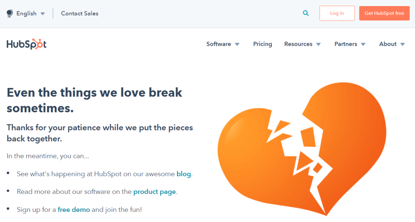
Hubspot also modified their 404 error page in a very conversational way, telling its users the options they have. They have the option to go to their blog page, or their home page or even access their free demo video.
4. Tell A Story
Who doesn’t love stories, right? You can use your 404 error page to communicate to your visitor what your brand is all about. You can talk about your brand vision, your motto, and the essence of your business. It helps the visitor associate with your brand and decide accordingly whether they want to engage with you.
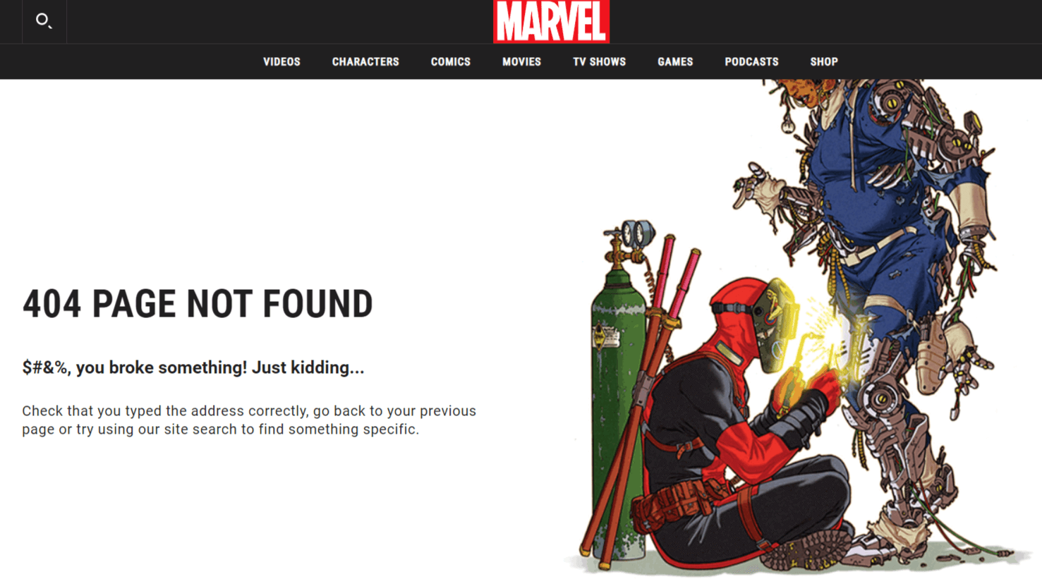
One of our favourite examples of this is the 404 page by Marvel studios. They take something from the Marvel universe and create their page around it. And it keeps changing!
Here is another very popular but no longer in use example by Maxemail. Every time you ended up on their 404 page, there was a funny bit on how you’d have to choose a member of their development team to fire. Then depending on whomever you’d select, you’d be directed to another page. It kept the visitors engaged and developed a good impression of the company.
5. Talk About Yourself
Talking about yourself to your customers is important. But it’s also important to know what to talk about. Bank on anything new that’s going on with you, something you’d like to promote. You can post a bit about some event you’re going to hold and you want them to register. You can also talk about an upcoming podcast or webinar or even a newsletter you want them to sign up for. It can depend upon whatever your goal for the month is. An upcoming sale, maybe?
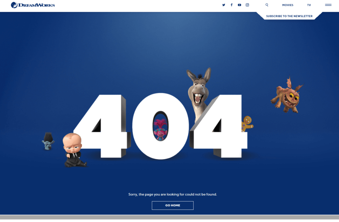
If you scroll down to the Dreamwork’s 404 page, you’ll see a separate section where you can register for the newsletter. They’ve also added a tab on the side in case you don’t scroll down. They also use extremely adorable characters to help do the trick!
6. Show Your Products
The reason why you’re in business at all – your product, service, or idea. Why not take the opportunity of a 404 page to showcase your best selling products? This is something that e-commerce companies can take the most advantage of. You can display your best products, their prices and add a CTA that will direct them to the display pages.

You will find a lot of examples for this. It allows easy access to your products and increases the purchase intent of the customer. Here are examples by Hilton hotels, Steve Madden, Giphy, and Comedy Central so that you can understand how various kinds of products can be showcased on your error page.

7. Humor Them – Use Intellectual Copy
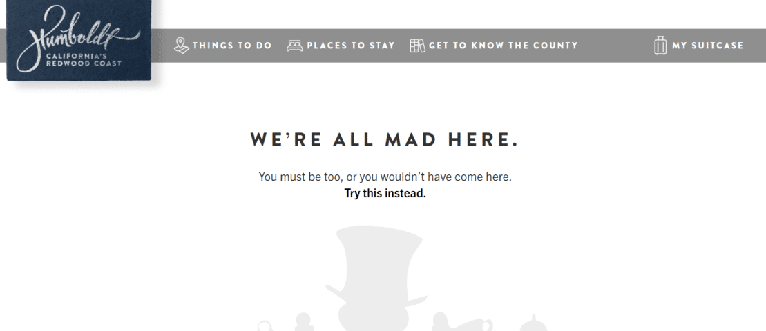
Consumers are always looking for something new. You can’t use the same old taglines again and again, right? Using funny copy is the key to standing out. You need something that a consumer can recall hours later and giggle about. A little ode to the ‘Alice In Wonderland’ by Visit Humboldt in their error 404 text made it an instant classic. They’ve modified the lines to suit their 404 page and included a CTA for you.
20th Century Studios is another example. (And might we add, a great one!)
8. Stick To Your Brand
Finally, stick to your brand story as much as possible. Try to centre your error 404 pages around what you care about. We talked about telling a story, creating a theme. You can do it all, and still resonate with your brand. The Pottermore website is a great example of this. As soon as a Potterhead sees the page, they can recognise the idea behind the page and the humor in the situation. It sticks to the franchise and has made the best use of a tiny incident from the book.

This helps your user recognise with your brand and projects your confidence in it. This example by Paramount is another great instance of brand selling on a 404 error page.
Conclusion
These tips are definitely a better way to engage your customers compared to your standard “404: Page Not Found.”
Marketing is all about finding opportunities in everything. And all the examples above managed to do so. We hope we’ve inspired you the right way. And if you have any ideas to boost 404 pages, we’d absolutely love to hear from you. You know where to find us!
Originally published Aug 07, 2020, updated Jan 17, 2023
