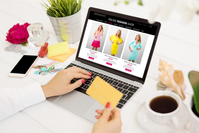
What ultimately sells your product? While there are quite a few elements that need to come together to best highlight your products. You need to think about search engine optimization (SEO), social media, and other strands of your marketing strategy. Your product page, though, is ultimately going to be what determines whether or not a user clicks on the “Buy” button and makes their way through the checkout process.
That said, it may be time to revisit your eCommerce store, paying careful attention to those product pages—think of these as the heart of your operation. Are they engaging? Are they easy to navigate or are they overly cluttered? Are the pictures of professional quality or are they pixelated and blurry? Even as a startup in the online world, you need to rival goliaths such as Amazon and eBay when you sell online, after all.
Your online eCommerce store is only as good as the way you present those products. So let’s take a look at a few of the hallmarks that go into creating an effective product page.
Key Elements of an Excellent Product Page
There are of course going to be several standard elements inherent to all good product pages on an online store. It is how well you execute these elements that will determine the success of a particular page and your eCommerce platform as a whole.
- Photos. Here is where the product takes centre stage and really gets its chance to shine. Photo quality is going to be imperative when it comes to your eCommerce website. Photo variety is also extremely important. A single image of a product likely isn’t going to get it done.
- Descriptions. You’re not only selling a product, you’re selling an experience—even a lifestyle—depending on the product. A sub-par copy will only turn potential buyers away from your eCommerce business. Appeal to their emotions. Tell them a story. Take them on a journey of sorts.
- Product Variations. So, for example, if there are colour or size options, you want to be sure to feature visuals of these choices. Users quickly grow frustrated when they can’t see the visuals of the different product variations.
- Call to Action. Don’t forget to tell your audience what you want them to do. Which is to buy, of course! That could be an “add to bag” or “add to cart” button. Some opt for a “buy now” option. Whatever, make sure it always features on your product page template.
- All Relevant Information. This would include product specifications, pricing information, shipping information. Make this readily accessible on your product page. You don’t want a potential buyer to have to spend precious minutes hunting around for this.
- Reviews. It’s a review-driven world. Offer those testimonials right upfront. People want social proof in determining whether or not a purchase is worthy of the money being spent on it.
The Best Ecommerce Product Pages of 2020
Not every online store gets it right when it comes to product page layout and design. You have to achieve that optimal blend of functionality, an attractive overall look, and ease of use. This represents the perfect storm when it comes to creating an effective product page.
These pages don’t have to be overly complex, either. Often with eCommerce websites and online businesses of this nature, simpler can be better. You also want to ensure that all relevant information is included and that it addresses the questions that a consumer will likely have. Here are twenty eCommerce product pages that have, in many ways, get it right in 2020.
1. Khrio.
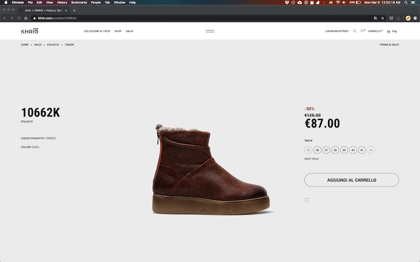
Without question, the product is the star here. It’s like the boot has a storefront all of its own. The ample white space allows for a definitive contrast between the product image and the background—again, helping this particular item stand out all the more. And while the details and information are minimised, they are still readily identifiable. The overall look and feel could not be simpler and yet its clean, modern feel effectively ties back into the brand.
2. Tag Heuer.
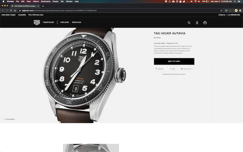
Tag Heuer is of course all about craftsmanship and the luxury associated with its watches. With this particular product page, the user can scroll down to see multiple images showcasing the various components of the classic watch.
The company understands its brand and what it’s known for, and they do a very good job here of playing to their strengths. Also a relatively simple design, it does what it needs to do; makes the watch look exquisite. Luxury and sophistication are very much the watchwords of this eCommerce platform.
3. Tokyo Bike.
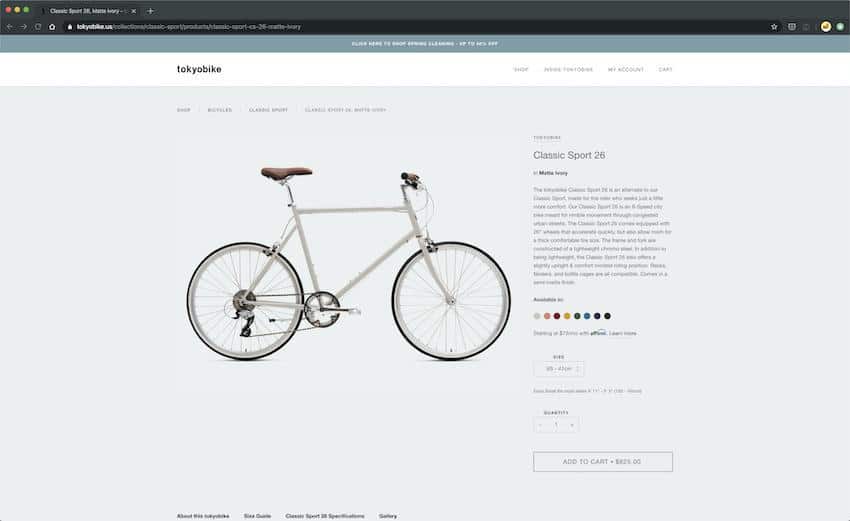
Another example of a streamlined and contemporary product page. Tokyo Bike is, as you can see, all about the bike. The images that follow when you scroll down highlight the bike’s various features. The description here becomes a key element in terms of getting users to put the bike into their shopping cart and checkout. It goes beyond the standard information and creates an emotional connection—rider to bike.
4. Skinny Ties.
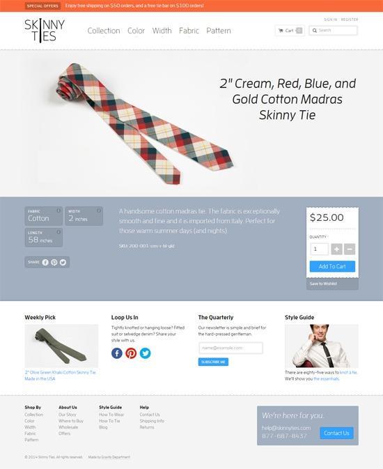
Not only do they tie retailers do a great job on this particular product page of showcasing the tie in a somewhat fun and whimsical way, but they also ensure that pricing is crystal clear. As is the “add to shopping cart” button. The user’s eye is first drawn to the tie and then by virtue of placement, page layout, and overall design, it naturally goes to the add to cart button. Simple, yet highly effective.
5. Apple.
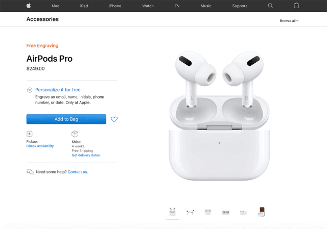
Apple never fails to excel in terms of its eCommerce site. And with this AirPods Pro page, they once again show why they are a tech giant. It is very simple and yet the two things that need to really stand out here, do. That’s the product itself and the shopping cart button. With the predominance of white, that “add to bag” button jumps off the page. And the way in which the AirPods are photographed and positioned is truly clever here. The business owners at Apple could sell products in their sleep.
6. Calpak.
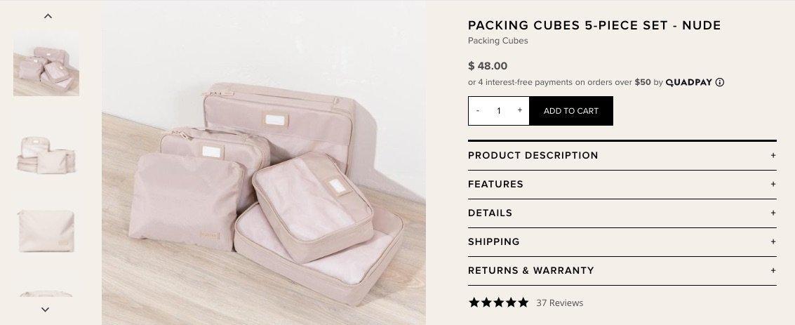
Calpak’s product page offers very clear access to product information. The layout here is also easy to navigate and the use of drop-down product info headings help keep this page simple, rather than overly cluttered. The eCommerce website’s use of colour also ties nicely into the actual product, thereby giving this page an overall pleasant look and feel. One which ties into the underlying emotional experience the brand is selling.
7. Mission Stone and Tile.
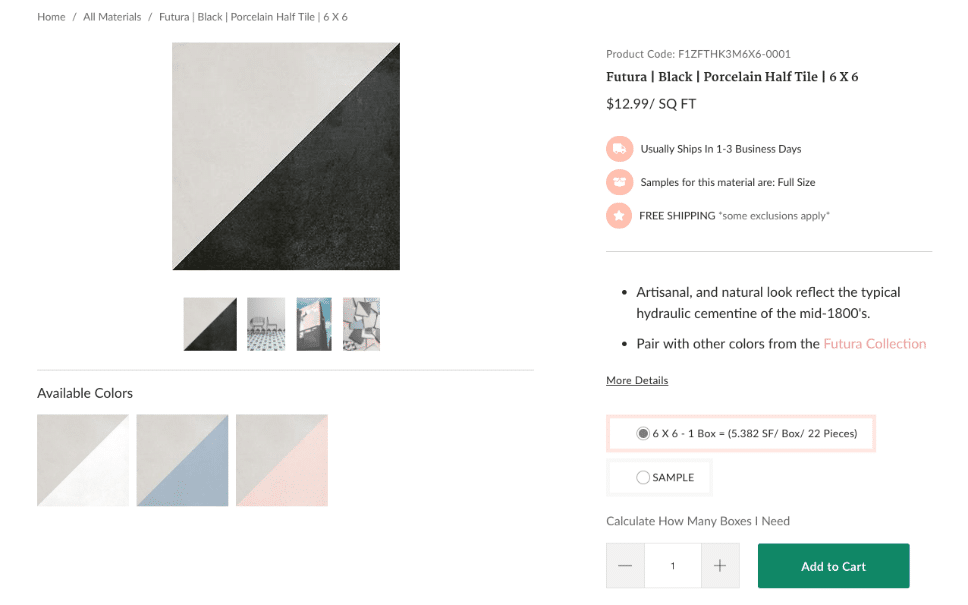
What this product page gets right is the type of images it offers. Tile, after all, is not quite as sexy as some other products out there. By enabling users to scroll over photos of the tile in a finished space, audiences now have better insight into what it might look like in their own property. And a huge part of selling is getting those potential customers to envision themselves making use of the product. This product page experience does that quite well.
8. Figs.
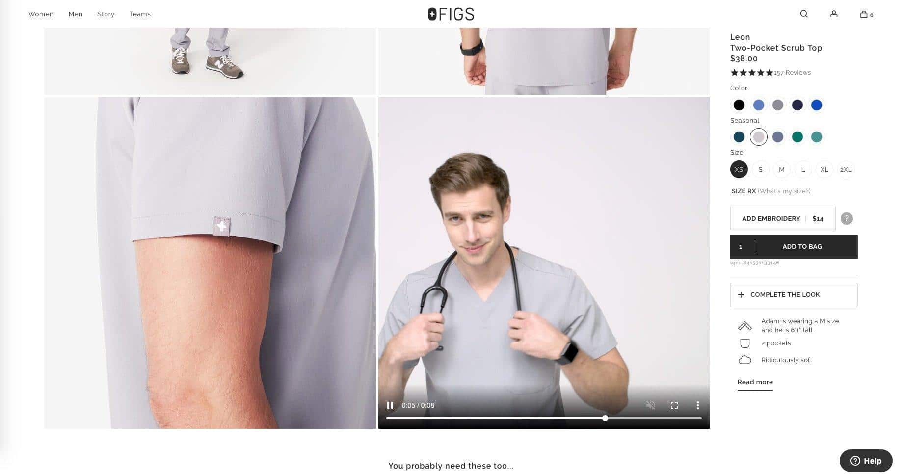
The introduction of video into a product page for any eCommerce store is definitely a good idea. Video not only helps bring your item to life, but lets audiences see it from just about every conceivable angle. Video, too, can supercharge your email marketing and other marketing tools.
With this Figs product page, the scrub top being featured is shown in professionally done pictures on the model. But then, as the model moves around in a video, users get yet another view of the product. It does a good job in terms of promoting its comfort and wearability.
9. Pipette.

For their product age, Pipette definitely went for that sentimental/emotional pull—clearly a good approach with the type of products they are selling through their online store. It is a more personal selling experience that we see here. The images used, and again a video comes into play, are all geared toward that concerned parent simply looking for answers as well as products.
10. Home Depot.
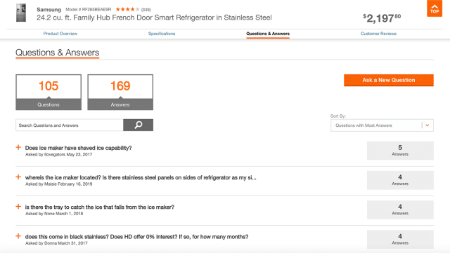
Another great feature of a really good product page is a questions and answers section, as seen on the product page of Home Depot; a renowned brand across the United States. Very often, people will have questions regarding information not found in the standard product info section.
Therefore, having space somewhere on your product page to address commonly asked questions about your product prevents users from having to search on a broader scale online. That, thus, keeps them on your page and makes them more likely to checkout.
11. Brooklinen.
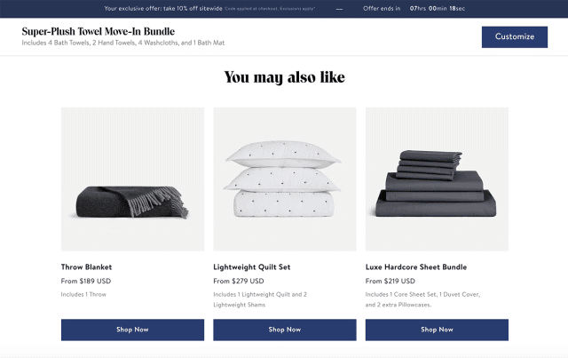
An effective eCommerce product page will also show audiences items related to that for which they are searching. What relates to the product they’re looking at? Does it pair nicely with another of your products?
Akin to bundling, by cross-selling, as this Brooklinen page does, you are giving users something else to think about and potentially consider buying. Major eCommerce solutions like Shopify, Bigcommerce, and Woocommerce make this easy to incorporate into your product pages, often by way of plugins.
12. Zappos.
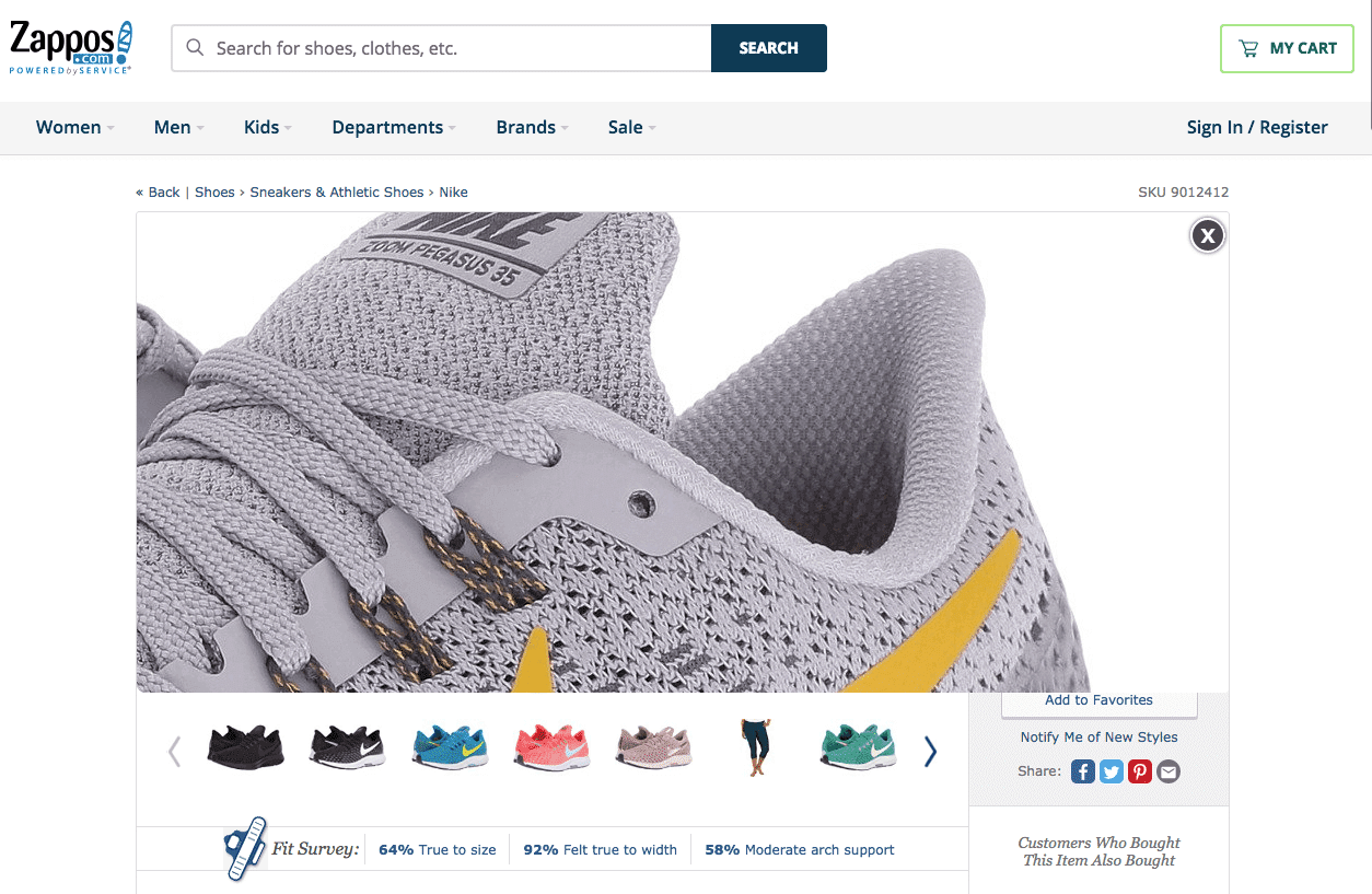
Without coming into your brick and mortar store and shopping firsthand, how are users going to see the smaller details? This Zappos eCommerce page does an incredible job of giving the user as up-close-and-personal an experience as possible. The level of photography here ups the wow factor and really does draw the eye into that product. And the ability to navigate through the various colour options is definitely an added bonus.
13. Best Made Co.
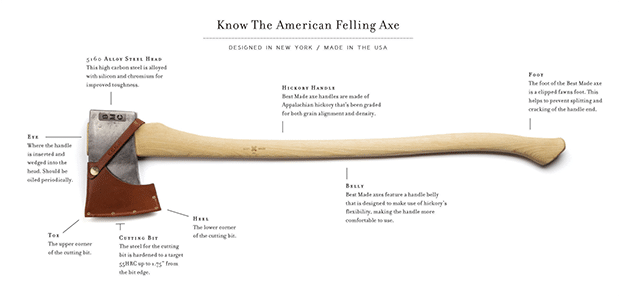
Best Made Co. doesn’t offer the cheapest axe on the market—far from it actually. But what they do on their eCommerce pages is to highlight the integrity of not only the product but the brand and what it stands for. They tell their story and users consequently are willing to pay more because that story resonates.
14. Graham & Green.
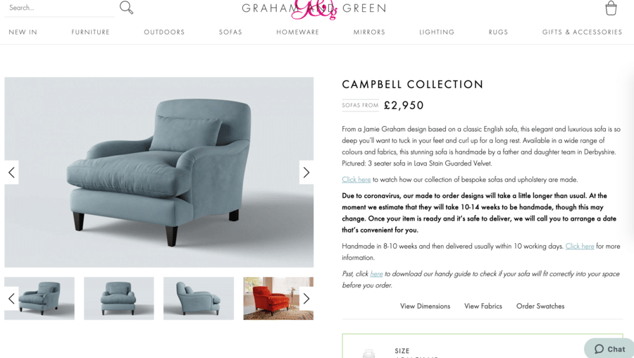
Selling big-ticket items online can be somewhat tricky. Furniture especially can be a difficult online sale to make. That said, in some instances–such as can be seen on this product page–more information may be better than not enough.
This product page actually gives users a combination of photos, size guides, and video so that they can gather all relevant data and make a more informed buying decision. Putting in that credit card number, emptying your PayPal account, or using Apple Pay to the tune of a few thousand pounds is not an easy thing to do. Especially when you haven’t seen or experienced the product. The trick here is to offer as much of an online “experience” as possible.
15. Bloom and Wild.
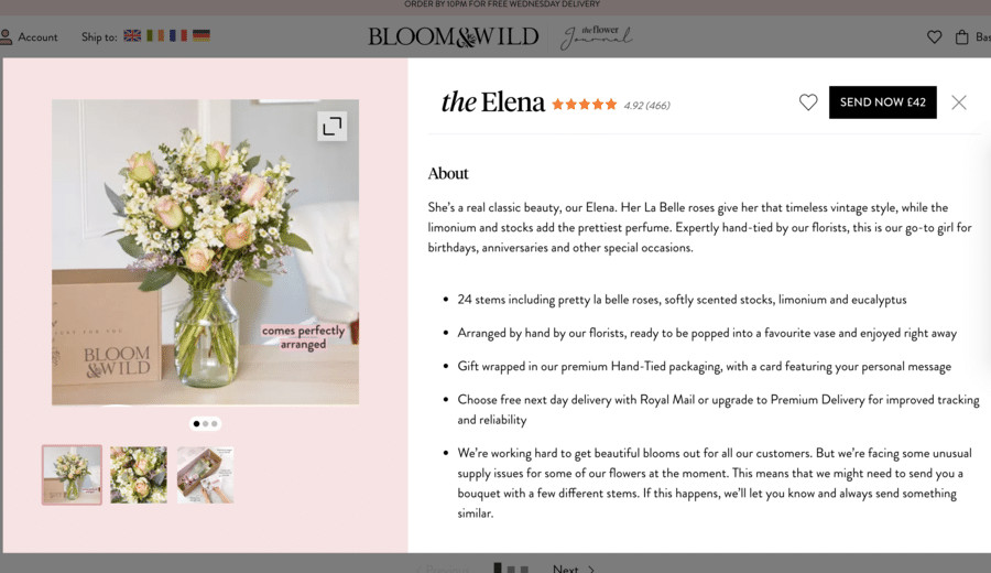
Flower shopping online is definitely a growing trend—many new businesses are popping up daily. So how does one flower shop’s product page stand out from the rest? Here is a good example. Bloom and Wild offer multiple images, incidentally showcasing their brand in the process. In describing the arrangement in terms of its name, its appeal, and inherent “personality,” too, the brand speaks to the emotional significance of what ordering flowers are all about.
16. MVMT.
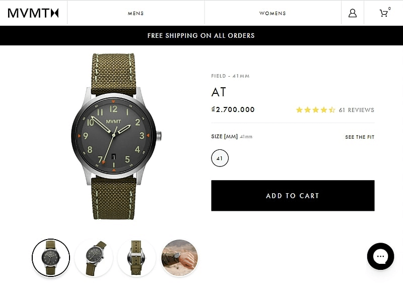
This product page keeps it simple. It highlights two very specific things by virtue of colour, contrast, and layout; the product and the call to action. They play the game brilliantly by understanding how people read and consequently approach an eCommerce page. Left to right, step by step, the elements are placed perfectly. And again, the way in which they utilise white space and colour make that message loud and clear.
17. BoxyCharm.
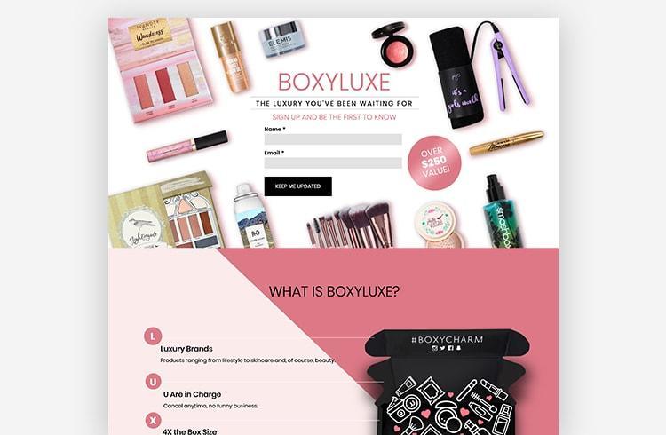
Product pages designed to help launch new products can be more difficult to get right. BoxyCharm’s landing page does a great job of getting their users interested in their new line. Not only is the design eye-catching and relevant to the core audience, but it also does a really good job of creating a sense of urgency and anticipation. Those users who already like their products or even those who are new to the brand, are apt to provide an email address based upon product appeal.
18. Sun of a Beach.
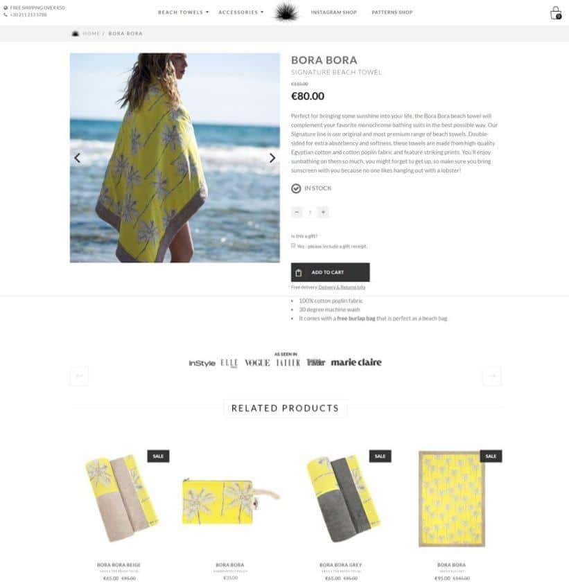
The layout is simple yet effective. And the accompanying products seen at the bottom serve not only to bolster the main product but also, given how the items are displayed, prove compelling enough to click on.
With this product page, the “as seen on” list—while seemingly small—does pack a powerful punch. Users are more apt to trust products and brands that have gained some national or international exposure. The logos featured do the heavy lifting on that front. The brand’s fun company and domain name add to the overall experience, too.
19. Innocent.
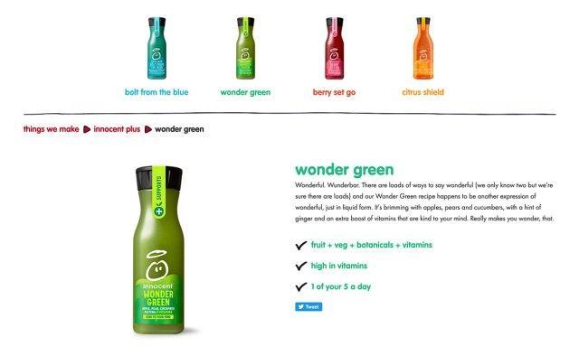
On this page, the features of the product are key. Their logo is synonymous with certain qualities. They understand their brand, they know what their audience expects, and they deliver. With the product description, they strive to connect more meaningfully and authentically with consumers—the copy definitely reflects this. And the unique way in which the important selling points are highlighted really does take this product page where it needs to go.
20. Nordstrom.
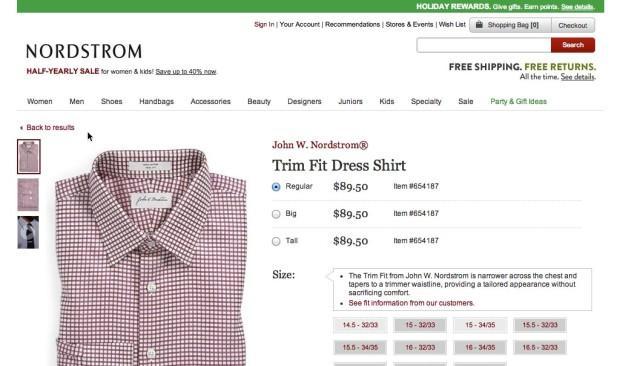
A product page that represents the Nordstrom brand quite well, the above example does a very good job of blending all elements so that the design is far more cohesive and pleasing to the eye. Colour palette is key here and, as a result, the product actually looks even more appealing. The other key component of this particular product page is the “back to results” function. Including this feature is critical, as users grow weary of having to start from scratch.
Ecommerce Store Trends to Watch Out For
Ecommerce, as with anything else, is constantly evolving. Keeping up with the trends year to year is going to mean the difference between your online business being competitive or falling flat.
In the above examples, we have seen product pages that make effective use of design, photography, branding, layout, and content, among other elements. What are some of the other trends you can expect to see in the months and year to come?
1. 360-degree product spins. Using models and video is always going to be important. Giving consumers the ability to use their own cameras to perform 360-degree spins of the product, though, and in this way manipulate angles themselves is going to be a pretty important factor in taking product pages to that next level.
2. Include a story. Authenticity is something everyone prizes. The more of a connection you can forge between your audience and the product in question, the better chance they will go ahead and put that product into their cart. Think about how to customize your product pages to suit your audience.
3. Live chat options. If your product page or eCommerce store doesn’t already have a live chat feature, you should definitely include one. This helps tremendously to streamline the customer journey and provide real-time customer support.
If visitors have questions about the product, about shipping rates, dropshipping, or return policies, for instance, giving them the ability to ask those questions directly on the product page is only going to help you make that sale. The less hassle they encounter, the more likely they are to convert.
4. Add to the wishlist function. Most product pages contain some form of add to bag or add to shopping cart feature. Not all, however, have gotten on the add to wishlist bandwagon. This only makes it that much easier for the buyer to quickly and easily return to that particular product page when they have finally made their purchasing decision.
5. Cross-sells and upsells. As mentioned earlier, offering users a variety of products similar to the one they may be purchasing is a strategy that could lead to even more sales. Upselling at checkout is also a growing trend. Maybe they’ve chosen to purchase a lower-end product. Why not show them a higher-end version? If it is priced right, they just might go for it. The improved margins on the more costly product could make all the difference to small businesses.
In Conclusion
Your eCommerce store is only as good as your product pages. If those pages aren’t getting the job done by way of presenting the user with a customer experience that compels them to buy, then there is a glitch in the system somewhere.
Spending some time to clean up that product page, make it more engaging, and easier to navigate—both on desktop and mobile devices—is only going to serve you well down the road. Not to mention, helping you to boost that bottom line!
Updated Jan 16, 2023